Glenda’s on a Joy Division kick.
I’ve always loved the album art for Joy Division’s Unknown Pleasures, even before I knew what it actually was. And then finding out that it’s the data from Jocelyn Bell Burnell’s discovery of the first detected pulsar? Beautiful.
A month or two ago, I saw Integer Division posted on the Fediverse and became re-obsessed with the art… and with various re-creations of it. A few months before that I’d seen the original artist’s reworking as a climate emergency message and thought it was a really strong statement, which maybe had me primed for more. And when I followed the rabbit hole from Integer Division to the Jupyter notebook it was based on and found the original data, then this great post on recreating and then extending it, I may have gotten low-key obsessed with doing one. Or more.
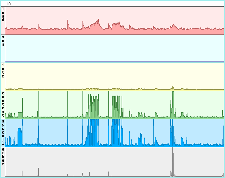
As a long-time Plan 9 user, I’ve spent a lot of time looking at various stats(1) windows. Each statistic you’re tracking gets its own ridgeline plot, although stats puts each in its own row. Here’s a representative example:

My obvious first thought was smushing those together, doing them as actual running stats, but it’s not actually a good representation for most data (it’s very clever for the pulsar, where it highlighted the periodic nature of the data, which was key to the nature of the pulsar). Also the C drawing primitives used for stats don’t really offer the sorts of abstractions I thought I might want for this. So I put the stats idea on hold.
Plan 9 comes with graph(1) and plot(1), inherited from Research Unix, for drawing graphs to the screen (or various plotters/printers, historically). I’d used these for simple graphs before and they seemed like they might be an easy fit. And they were, at least for a first pass.
With the raw data from above saved locally, I was able to put this together quickly:
data=$home/lib/pulsar.csv

# Manually tested numbers to get pleasant visuals.
# topline should be spacing times data lines (80 in the original).
topline=320
spacing=4

awk -F ',' '
    {for (i = 1 ; i <= NF ; i++) printf "%d %f\n", i, '^$topline^'-('^$spacing^'*NR)+$i
    printf "%d %f \" \"", i, '^$topline^'-('^$spacing^'*NR)+$i}
' < $data | graph -b -g 0 | plot &
Awk turns the csv file into what graph needs for input;
-b separates each line so we don’t get a nearly-horizontal line from
the right end of each line to the left of the next down,
and -g 0 turns off graph’s normal grid lines.
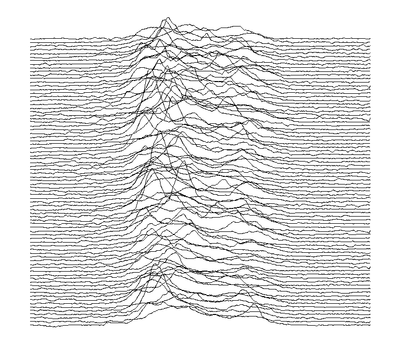
And we get this:

This worked out well! As a reproduction of the original, there’s really only two issues. First, the colors are inverted. This led to a lot of digging into plot’s source and… there are issues. This code comes from Research Unix, and it’s showing its age. The documentation got an incomplete conversion from the old version, where it was much more used to drive physical plotters and printers (there’s a whole referenced table that’s just missing). There are a lot of inconsistencies in how colors are handled, with some shape types using the foreground color and some the background, in ways that don’t seem to make a lot of sense (and certainly don’t track the documentation). Also, not an issue for this project, but other things like pen shape are just unimplemented. Still, it looks pretty cool this way, so I wasn’t to bothered. Second, and a bigger deal, is that these aren’t ridgeline plots. The fact that they’re simple lines makes them harder to read when they’re so densely packed like this.
My first approach for dealing with the second problem
was to put some color on things.
I replaced the awk | graph | plot pipeline with this version:
awk -F ',' '
        {for (f = 1 ; f <= NF ; f++) out[NR,f]='^$topline^'-('^$spacing^'*NR)+$f
        if (NR>=maxr) maxr=NR
        if (NF>=maxf) maxf=NF}
    END {for (f = 1 ; f <= maxf ; f++) {
            for (r=1 ; r <= maxr ; r++) printf "%f ", out[r,f]
            printf "\n"
            }
        }
    ' < $home/lib/pulsar.csv | graph -a -g 0 -o 80 -p bcgkmrw | plot &
Graph’s color cycling didn’t work the way I expected,
so i switched to -o 80 to have it handle that itself.
The results were pretty good,
although I don’t love some of those colors on a white background.
And, really, it didn’t help enough;
this really wants the proper ridgeline plots.
I liked my original better.
I thought I might teach plot about a new type of shape
(and then I could make sure it made sense).
But thinking about how I’d define the shape,
given that plot knows much less than graph about the actual graph,
I quickly realized it was just a filled polygon.
I put together an awk script, mkridge, to process graph’s output.
It’ll take an m instruction followed by several v instructions
and spit out an fi instruction matching the shape.
I’d take the graph output in acme, highlight the relevant instructions,
execute >mkridge in the tag, and paste the output before the block
(this should be a streaming filter I could put in the pipeline,
but I became disillusioned with this technique before I got there).
This worked out… okayish.
I never got it to a place I was happy with,
mostly because the color issues I talked about with plot
felt like they were going to prevent this from ever really being satisfactory.
The original, plain-line version looked better than anything else I got to.
So I gave up on this angle and moved on… back to something close to my original idea.
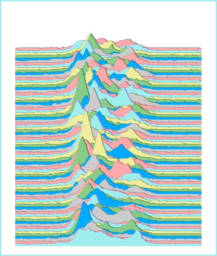
And now I’ve got jocelyn.c, which draws this:

I’m very happy with it.
The biggest issue is that coming up with values for the various options —
x and y magnification, offset between graphs, and line thickness —
that actually look good on a given display is very much trial-and-error.
The default values look nice on my mac under plan9ports
(where, happily, this compiles without change),
but on my qemu terminal, -x 2 -y 2 -o 8 -t 1 look much nicer.
Less importantly, I’d like to get it to resize the window if the screen’s big
enough to show the whole image with the given options,
but I haven’t yet figured out how to do that in a cross platform way.
Anyway. This is all probably a lot of writing for a silly lark, but these were fun to do. I’m particularly pleased with how quickly the first and final versions came together (and maybe there’s a lesson in the fact that the middle versions both came out worse and were more work to do).