[This is incomplete.]
Phillip Stearns' Installation at Burchfield Penney
In early March of 2015, I was in New Jersey, visiting my mom and sister, when Phillip Stearns posted a link to a new installation at the Burchfield Penney Art Center, in Buffalo, New York. The installation, A Chandelier For One of Many Possible Ends, was strking: 92 light elements, each of which looked sort of like an old-style fluorescent tube, wired to individual Geiger counters, arranged in an array in a dark, otherwise-empty room. The lights flicker at random in response to cosmic rays or background radiation, with each flicker accompanied by an audible "click". There was video online, but it was obvious that the in-person experience would be very different. I wanted to see it.
I met Stearns at the 2013 XOXO Festival in Portland, Oregon. I wasn't aware of him before that, but for me his work became an exemplar of a theme of the festival: the interaction between the physical and the virtual or electronic worlds. I've been following his work ever since. His High-Voltage Images and Year of the Glitch projects, in particular, have been particularly inspiring.
Buffalo is not between New Jersey and Cleveland, but it was worth the detour. I spent a night at an old friend's house in Corning whom I'd not seen in far too long, and the folks at Burchfield Penney arranged a bit of a tour. Tony Bannon, the Center's Executive Director, had some interesting background on the Center and the installation, and introduced me to Heather Gring, their Archivist. She gave me a peak at a pair of not-yet-launched exhibits, which was a real treat. Both were great to see, but one in particular had some work I found really thought-provoking; I'll write something about that soon. The Stearns installation has concluded, sadly (not exactly a timely writeup), but the other two are going on for a while, and I'm now tracking what Burchfield Penney is doing generally. If Buffalo isn't too far out of your way, I'd recommend a visit.
I had a lot of fun photographing this thing. It wasn't easy: simply snap a picture and you're likely to get a black room. I was playing with two very different cameras: my fairly new Sony α77 DSLR, and my very old Super Ricohflex TLR. I also didn't have a tripod while shooting. I'm pretty happy with the results, though. These are basically unprocessed: the film scans are straight off the scanner, cropped as close to the edges as I could get, and the pure digital files are what the camera produced. You can click on the images for larger versions.
Super Ricohflex
The Super Ricohflex is a Twin-Lens Reflex camera from about 1956 that shoots medium-format film. It was a mid-range camera when it came out, but it's my favorite medium-format camera to shot with. To get a good shot of the chandelier with it, I had to play around with multiple exposures, or manually-timed long exposures. Even using a light meter wasn't much use here. I tried four different things, three of which turned out more-or-less the way I'd hoped.
These are all shot on Kodak 400 TMX-2 Black & White 120 film. Not having a tripod on hand, the camera was sitting on the floor, and I manually controlled the angle (moderately well, in 3/4 of the shots). This is not a method I'd suggest, but it was educational for me.
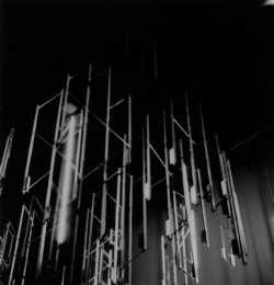
This is the first thing I tried, and turned out to be my favorite.
You can't see as much of the structure above, but I like how
that makes it seem to be descending out of nothing. The individual
lights glow a bit more than I expected, and more than in the other
shots. This is 4 exposures, each for 1/25", at f/3.5 (the widest this
camera will go).
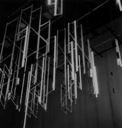
I didn't really expect this to turn out usably at all: a single exposure,
roughly ~2" (shutter manually held open, counting in my head). I
was realy surprised at how little motion blur there is. This shot gives
the best view of the upper structure, which is nice for documentation,
but totally lacks the feel of the room. It's not that the camera's
showing you anything your eyes couldn't see, but your brain doesn't
hold the images long enough to put them together proerly, like the fim
does. Despite the surprise over how little blur there is, I think this ends
up being my least-favorite film shot.
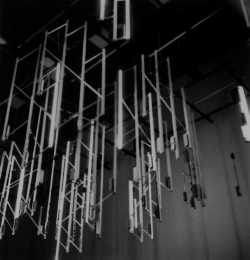
Aside from my concerns over holding the camera steady enough,
this was the shot I expected to be best based on light calculations
in the room: 10 exposures at 1/10" each. It ended up pretty good—
I'd say the brightes of the bunch, with the most detail on the lower
parts of the individual light tubes—but I'm a little surprised by how
birght the wall is, relative to the previous shot. I tried to get some
good shots of that later with the digital (the shadows were almost as
dramatic as the chandelier itself).
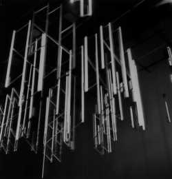
This pushed things too far: 30 exposures, each at 1/10". Honestly,
this is pretty much how I expected the previous two shots to turn out; I
guess if I only have to control for one axis, handheld can be better
than I'd thought. Also noteworthy: the flicker-heavy nature of the
light source means that there's less difference in overall brightness
than I'd expected, and the things going on in the camera are swamped
by the randomness of the light; in particular, the 10@1/10" seems
brighter, overall, than the 30@1/10" (this holds up in the original
negatives).
A tangent
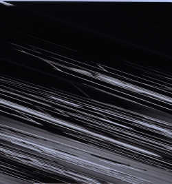
My ancient ScanJet 6300C has been
getting harder and harder to use in each version of OS X (HP's simply
given up on support for it), and I hadn't gotten it working with Yosemite
before scanning these. I haven an Epson that still works well with the
Apple software, but the quality isn't terribly good.
In trying to get the ScanJet working, I ended up with this happy accident
you see here. Aside from just enjoying the fun effect, I thought it was
particularly fitting in light of Stearns' glitch work. Seems even my
scanner is a fan.
DSLR
I also had my Sony α77 DSLR. I've only had this since the end of December, so I'm still getting used to it.
Video
There are better videos of this online, but here's some I took that worked out well. Note that I haven't done any resampling or editing on these, so some are quite large. I doubt this'd be a problem in the format presented here, but I should probably note that at the actual display they did have a sign up warning folks with certain visually- triggered seisure disorders, so if that's you, use your judgement.
The first is my favorite: shot from directly underneath the installation.